1 мин чтения
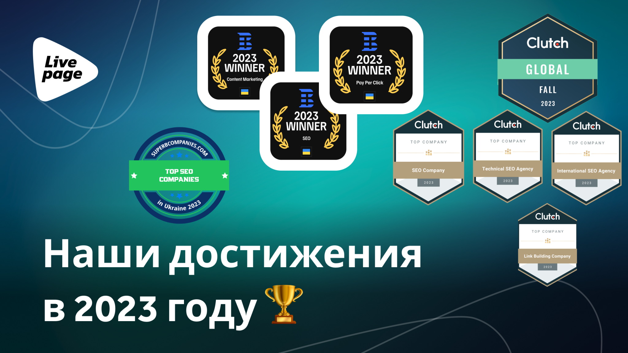
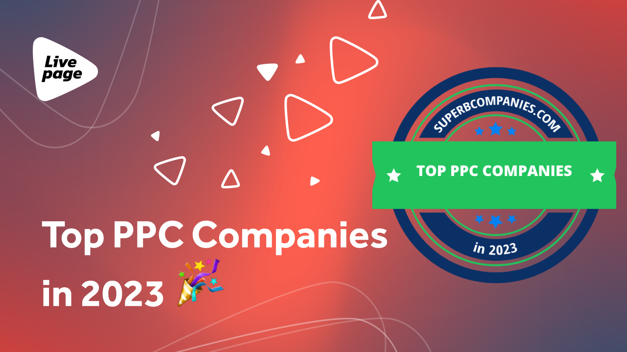
Livepage в рейтинге ТОП PPC компаний 2023
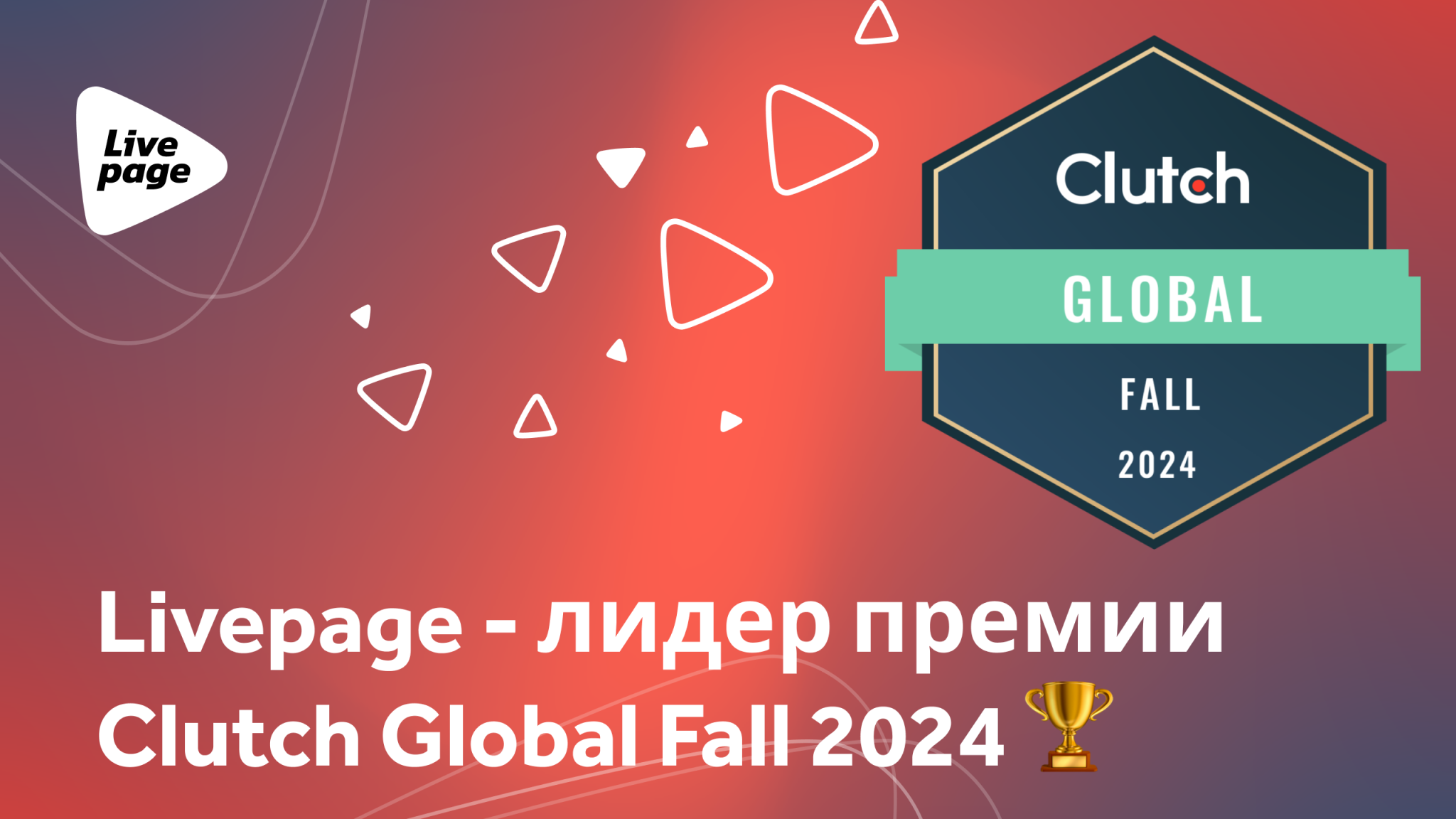
Этой осенью, мы получили новую награду от Clutch, а именно GLOBAL FALL 2024 🏆 Clutch - это онлайн-платформа, которая специализируется на рейтинге...

«Команда Livepage доказала, что является надежным источником для быстрого роста в Интернете. Мы начали с 2 000 посетителей в месяц. За 3 года вместе с Livepage мы достигли 70 000 посетителей и более 100 лидов с сайта в месяц.»


«Мне приятно знать, что мы можем быть на связи в любое время. По поводу результатов: да, с 2015 года мы работаем, по сути 6 лет, и наш трафик в самые яркие моменты вырос в 5 раз. Я не могу сказать, что Livepage была нашей первой SEO компанией, но стала первой удачной SEO компанией.»

«SEO работает! Если кропотливо и методично заниматься оптимизацией контента, то это приносит плоды. Мы установили этот факт благодаря работе с Livepage. Хочется отметить, что компания использует широкий набор инструментов, подходов, все совместные проекты были хорошо распланированы, при необходимости ребята мгновенно подключают дополнительных специалистов.»

«Я доволен быстрым выполнением заданий и мгновенными ответами на мои сообщения.»


«Мне нравится комплексный подход, который предлагает команда Livepage. Абсолютно все члены команды работают вместе; все в курсе деталей проекта. У нас одна общая цель – увеличить продажи наших услуг, и команда прилагает максимум усилий для достижения цели.»


«Специалисты Livepage — это опытные и клиентоориентированные профессионалы, с которыми легко работать. Мы были приятно удивлены тем, как быстро команда Livepage разобралась в особенностях нашего бизнеса и развернула PPC кампании с учетом наших бизнес-целей. Это помогло нам увеличить прибыль и ROI в кратчайшие сроки.»